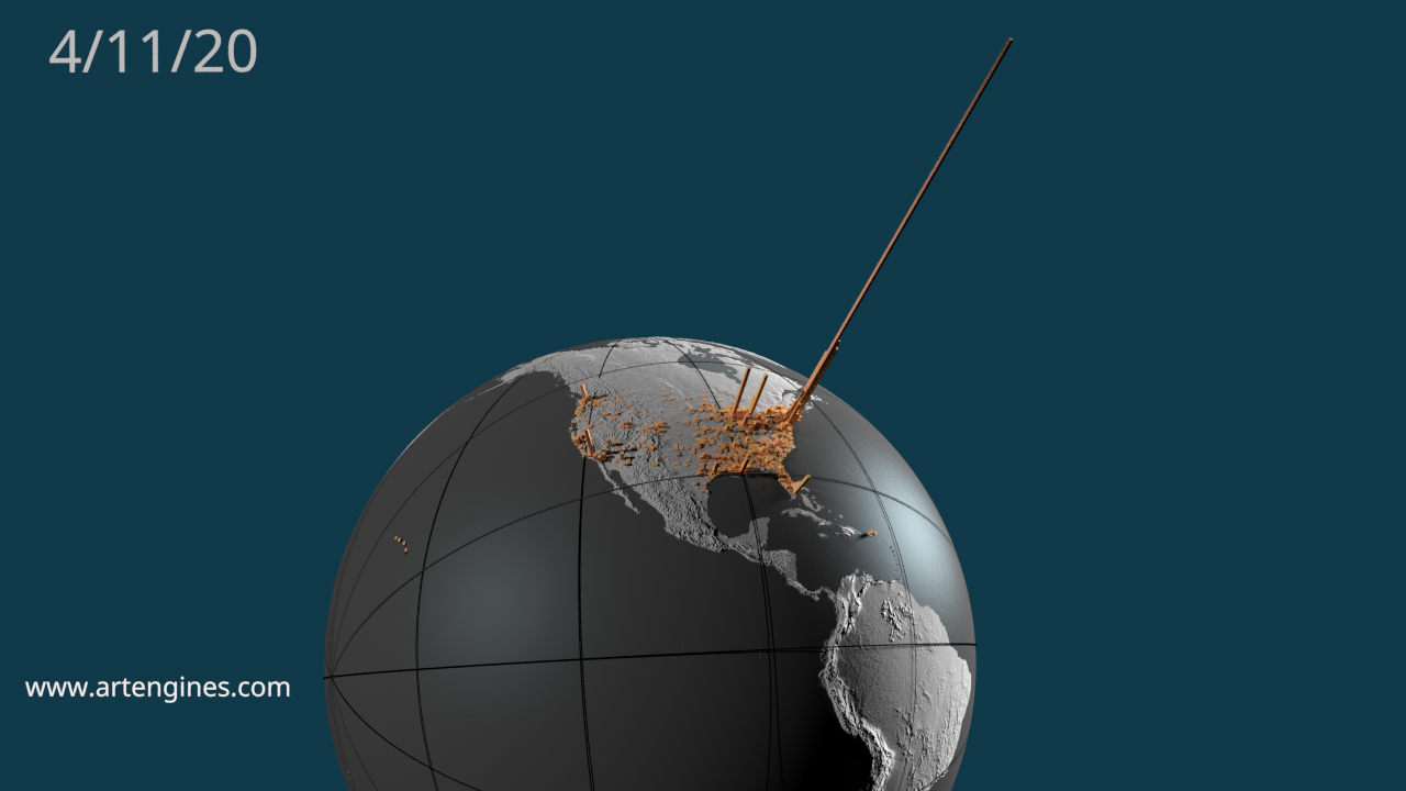
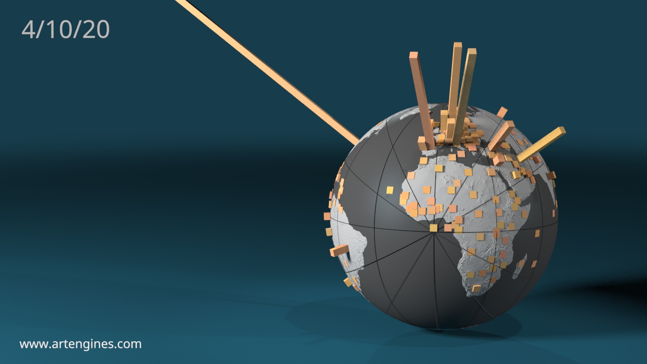
The images below contain bar charts protruding from a globe of the Earth. Each bar’s height represents the number of confirmed cases of Covid-19 in that district. Images below show 1000 to 2000 locations in the US and 260 countries around the world. You can see how the virus rate is growing and spreading over time in the video sequences.
These visualizations are based on data collected by Johns Hopkins University. The animations and images are rendered in Poser.
1200 locations in the US:
Time Series:
1200 Top US locations confirmed Covid-19 cases. Youtube link.
260 Country time series. Youtube link.
To see how this was created, see the blog entry: https://home.artengines.com/wp/how-was-the-visualization-created/


